A Reflection on Liveries

In my preparation for my trip to the 500, I always spend just a little time pouring over the intricacies of the starting field. How many previous winners? How many rookies? What are the countries of origin? Any bits of trivia I find interesting.

Some examples; Row 10 this year is the only row which features only one of the engine manufacturers (Chevy); Lundgaard is the first Danish driver to make the field; Row 5 is the only all-USA native field; etc.

In doing so however, I also look at colors and liveries in the spotters guide. Between qualifying weekend TV coverage and reviewing the guide, I noticed there are virtually no liveries that I would consider unattractive this year. All are notable and few replicate others so closely that they’re difficult to identify immediately.

The livery game in Indycar has stepped up in the last few years and I want to say that it is about as good as it ever has been and perhaps 2022 is the best of the 20s so far, but as is typical with everything else in sports, comparing eras separated by years and decades means that technology factors into the discussion.

I do think that as wild as the vehicle design was through the 1970s, the liveries of that decade were a reflection of that era in freedom of creativity. When one considers that nearly everything (if not everything) was hand-painted at that time, the work to produce a memorable and visually-capturing livery was truly an art.

Perhaps only rivalled by the 1973 field, one of my absolute favorite fields, subjectively judged by liveries, is 1970. Below is the hyperlinked year of the field for your perusal, of images from the Indycar.com site.


1970 – The dawn of a new decade and new era in racing meant creativity was in full flow. The #2 Johnny Lightning Special driven by Al Unser was the actual race-winner, but is also one of the most recognizable liveries of all-time now over 50 years on, but first appearing in 1970.

In 1970, Foyt’s Coyote Red team cars had become easily recognizable as did the Granatelli Team STP day-glo red, and the McLaren’s Papaya orange, but other non-works liveries that standout include: the #25 Cablevision car of Lloyd Ruby;

the #97 Wynn’s Spit Fire Special driven by Bruce Walkup;

The #22 and #23 Sprite soft drink liveries driven by Wally Dallenbach and Mel Kenyon;

And the #89 Nelson Iron Works Special driven by Jerry Grant.

The #89 I particularly enjoy as it evokes a feeling of walking into a groovy ’70s lounge with dark paneling, brown vinyl-covered cushy club chairs, shag carpeting, and swag lighting everywhere, including the restrooms.

Wait! I’ve been there. It’s called the High Life Lounge in Des Moines, Iowa. When I made the trek to see Indycars in Iowa in the summer of 2018, we made sure to hit this classic spot and so should you (if you’re over 21 years of age, that is).

I believe art generally reflects the times and even so when applied to the mechanical racecar. The variety of chassis as well as the creative liveries in the field of the 1970 Indy 500 really gives one a sense of the times.

Much Ado About Liveries

What is it about liveries that adds to the enjoyment of auto racing?

If you’re anything like me, when an off-season wanes and a new season approaches, I appreciate any and all visual coverage of pre-season activity. New images are the desperately-needed salve from the abrasively long off-season. While the sounds from video clips are often familiar and quite welcome, one thing changes more frequently than any other piece in our autosport appreciation – the livery.

During the recent IMSA Roar Before the 24, dutifully placed in the first week of the new calendar year, North American racing fans get their first glimpses of new sports car liveries in action. Often this time of year will include new pronouncements of sponsors and drivers and promotional plans for the upcoming season. Sports cars provide a generally larger substrate for design and history shows us how memorable and popular those can be.

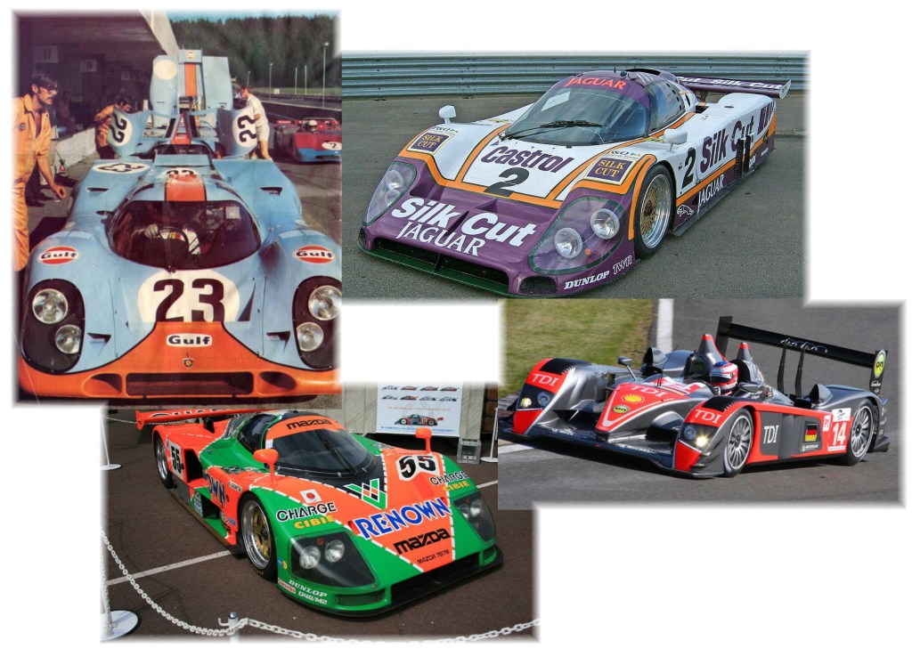
When I say “Silk Cut Jaguar” or “Audi R10 TDi” or “Gulf Oil Porsche 917” or “Mazda 787”, immediately images of a famous and often race-winning livery pop into my head. It’s those things, shared with others around the globe that makes more communal and intimate the experience of autosport enjoyment. The more famous the event/circumstance, the more recalled the livery. Winning, or sometimes merely striving valiantly in incredible situations, often is the momentous situation that places an indelible visual representation of that moment and machine and humans in our brains.

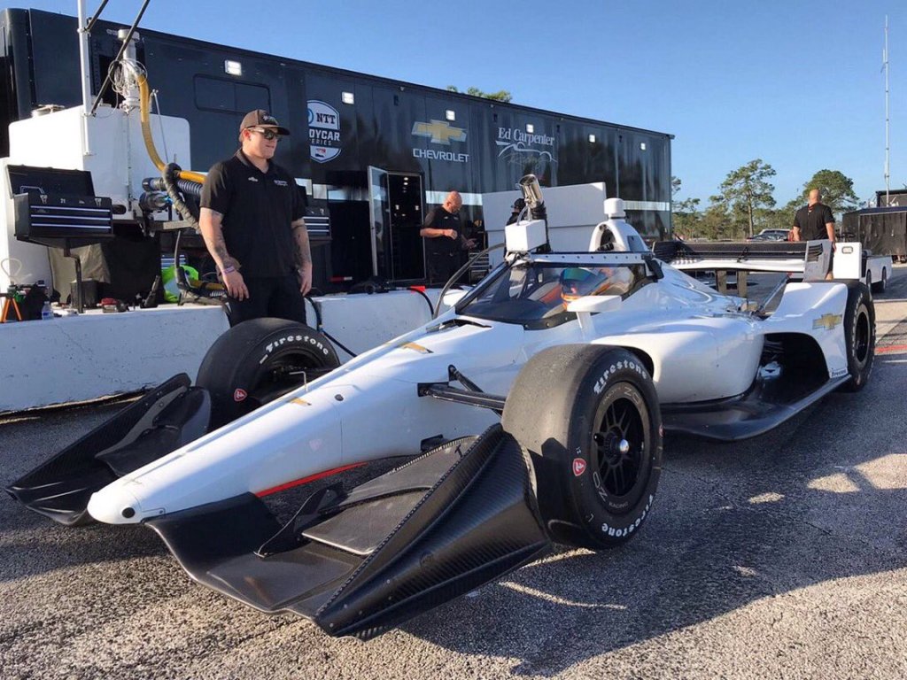
In the second week of 2020, my focus shifts toward Indycar at Sebring for spring testing sessions. 2020 brings a fairly radical new look owing to the advent of aeroscreens. This welcome safety feature also becomes the moment in history that notably alters what we consider a modern Indycar. I imagine a time, even just month from now when a IR15 Dallara without the aeroscreen will seem oddly spartan and exposed.

Regardless, the new era of Indycar is upon us in several ways and as information trickles out of testing, including new entries, sponsors, and liveries, my appetite for the upcoming Indycar season only becomes more ravenous following the off-season hibernation we experience. How will the new aeroscreens add to the livery design? The blank canvas has a new shape.

(c) 2020 Ed Carpenter Racing (via Twitter)

While we often celebrate a renown livery on modern vehicles in tribute, so much that one sanction even takes to throwback livery races, I still feel the classics of tomorrow come from today. In 2019 I noted how well the liveries were done in Indycar from top to bottom of the field, and the artists of today are doing a great job on a difficult substrate, creating some legendary liveries I imagine we’ll regale in 2030.

Often, it’s the events that transpire that influence favor on our recollection of the liveries which will live far beyond their racing life. Even as recently as 2016, the modern and (expected to be) one-off NAPA livery for Alexander Rossi became so memorable from his Indy 500 win, and subsequent exposure, that it now sits among the most recognized, staple sponsors of the modern Indycar era.

As we await more official liveries and note changes to existing ones provided by the aeroscreens, what are some of the newer IMSA or Indycar liveries of 2019 and 2020 that most quickly come to the top of your mind? Like NAPA, which do you see as ‘instant classics’?

Let me know what pops into your mind’s eye first…

A Welcome Sight – 2019 Indycars

Greetings everybody!

I hope everyone has fared well in our open-wheel, semi-hibernative state since our last INDYCAR race back in September of 2018 (some 25 weeks ago).

Where I live in Northern Indiana, the winter has been egregiously long and cold. Starting in earnest in mid-November, the wintry weather tends to make one draggy to the point of forgetting what day/week/month it is until that first glorious spring day appears, or INDYCAR starts in earnest on the Albert Whitted Airport circuit, whichever comes first. This year, it’s INDYCAR that has awakened me from the winter rather abruptly.

It’s not lost on me how ridiculous it seems that something nearly 6 months in the making can ‘sneak up’ on someone, but alas, here we are. I intend to hit the ground running however and this inaugural post of 2019 will review one important visual aspect of the sport before the green flies in St. Pete – the liveries.

Something like this cannot typically be done until the week before the first race anyway, as deals and sponsors get tied-up, and the reveals often happen just before the season starts, so I forgive myself for not posting on this sooner.

A nice pictorial summary of some of the 2019 liveries can be found at this link to the openwheel33 blog who got some great shots from the pre-season testing at WeatherTech Raceway Laguna Seca. I’ll give my 1 (lowest) to 4 (highest) star rating on my opinion of the newest liveries for St. Pete from the spotter’s guide, seen below. Please feel free to disagree with me here 😀.

Car number – Driver Abbreviation – Primary Sponsor: Rating, comments.

2 – NEW – Hitachi – ✪✪✪✩: 3.5 for a very solid, classic Penske-type livery that rarely inspires but is always easily recognized and on-brand. 

4 – LEI – ABC Supply,
14 – KAN – ABC Supply – ✪✪✪: 3.0 for another very recognizable, stable, albeit dated design that actually has looked better on the new chassis than on the previous one. It still smacks of a swoopy-early-2000s design and I think it could be updated and improved with only a few tweaks.  I still struggle with who’s who between LEI and KAN at speed even with the color flipped. Maybe that’s more a sign of a feeble brain than design.

5 – HIN – Arrow,
7 – ERI – Arrow – ✪✪✪✪: 4 for a design that is not only easily-recognized, but also has the benefit of looking extra sleek (fast) by day or night, thanks to the colors as well as the drivers. To be seen whether I struggle recognizing which car is which with the subtle color variation. Both look great however and neither looks the lesser of the other.

9 – DIX – PNC Bank – ✪✪✪✩ 3.5 for a design that initially didn’t impress me (how could it following one of the greatest liveries of all-time – Target), but is growing on me.  I like the colors and again this is unlike any other livery out there which makes it easily identifiable in-person or on TV.  I get the slick color gradients employ the logo graphic, but it seems to wash out the natural appeal of the chassis silhouette.

10 – ROS – NTT Data – ✪✪✪ 3.0 for to the League Title sponsor’s livery. Regretfully, as this design forsakes flashy design for simple, recognizable appeal, it just leaves me wanting a bit more. I can’t help but wonder if incorporating the Swedish flag of pilot Rosenqvist somehow with the similar NTT Data blue wouldn’t add some welcome zip and appeal to a certain foreign TV demographic.

12 – POW – Verizon – ✪✪✪ 3.0 for yet another solid Penske team livery that at one time was more easily distinguished from the field, now suffers from sameness that could be improved with a different color styling. Tough to just change the reigning Indy 500 champion winner’s livery but with the right touches, it could also be improved.

15 – RAH – United Rentals – ✪✪✪ 3.0. This RLL car is fairly recognizable and doesn’t necessarily offend but there just seems to be a lot going on in terms of colors and designs with sponsors. As has been noted in years past, the blue and white schemes seem dated and overused. Can’t say that about how the 2019 field is appearing, but this scheme also seems to lack an overall team cohesion with it’s sister car.
30 – SAT – Seeman-Holtz – ✪✪✪✫ 3.5 for the sister to the 15. Again a lot going on visually from the sides, but I can’t not give this an extra half star rating for that nose design which makes me recall the gorgeous Player’s liveries of the late 90s.

18 – BOU – SealMaster – ✪✪✪ 3.0 for a car that is easily recognizable. I can’t decide if this looks more like some sort of high-speed emergency vehicle or and indicator that Wiz Khalifa is a new Indycar team owner. I appreciate the stones it took to be as aggressive with the color and striping as they did which is why they get a 3.0 and not a 2.5. Red lettering on black backgrounds always causes visual issues. The lettering needs a more pronounced white outline as a contrast to the black.

19 – FER – David Yurman – ✪✪✫ 2.5 for a flashy black-on-chrome design, albeit with little interest beyond that. The T-1000 Terminator would be proud. the dorsal fin contrast in black with the Honda lettering is a welcome bit of accent similar to other designs, yet more noticeable on this livery.

20 – JON – Autogeek,
21 – PGO – Autogeek – ✪✪ 2.0. Again with the dreaded red on black lettering combined with an overall scheme that appears as a refugee from the early IRL days. Sorry ECR, this ain’t cuttin’ it. After years of solid and easily recognizable liveries with Fuzzy’s, I can’t tell if the new sponsor is Autogeek or Autogreek or Autoweek. Unremarkable from most any angle, I hope they have something better in the works by the time Indy rolls around.

22 – PAG – Menards – ✪✪✪✫ 3.5 for that great 80s-90s nostalgic neon yellow look combined with the simplicity of the Penske team liveries. You’ll never not be able to remember this car and sponsor because it’s seared into your retinae. Looks like it’s moving even when standing still. 

23 – KIM – Tresiba – ✪✪✫ 2.5. To be honest, I’ve never liked the color scheme of this livery, but it does the job for standing apart and being memorable for the sponsor. Easily seen when on TV and in-person.

26 – VEA – Gainbridge – ✪✪✪✫ 3.5. I didn’t like or dislike it when I first saw it, but the more I see it, the more I like it. Easily visible are the sponsor’s name and graphical chevron branding. The blue accents work well and make this a more recognizable livery than it might be otherwise.
27 – ROS – NAPA – ✪✪✪✪ Four-Point-Oh for what I feel is the best livery in the paddock. Visually as near perfect as a livery can be on TV or in-person. Stands out and looks great at every angle. Maybe the car-parts-related sponsor is what tips this to the highest rating. The Andretti stable has a very good thing going with their team cohesion and design elements (just fore of the cockpit).
28 – RHR – DHL – ✪✪✪✫ 3.5 for a livery that looks great and instantly recognizable. Just a light bit of pizzaz away from being a 4. Maybe a third color wing accent like the Gainbridge car.
98 – AND – US Concrete – ✪✪✪✫ another 3.5 for a very good design. Sometimes a bit difficult to see on TV, it looks good in-person and the logo really pops. I may be just a bit weary of carbon-greys, other wise this could push for a higher rating.

59 – CHI – Gallagher – ✪✪✪ 3.0. More of the swoopy bits which usually make me cringe, but they’re done better on this car. Maybe it’s because the monochromatic blue scheme is attractive to my eyes and the swoops add interest where few other sponsors names/logos reside.

60 – HRV – Sirius XM – ✪✪✪✫ 3.5. As a sister car to the SPM Arrow cars, I like this livery very much and the hot purple metallic over black is a sweet look that is memorable and eye-catching. Great for sponsor exposure, however, the Sirius XM sponsor doesn’t utilize purple in their logo in anyway, so there’s a slight bit of dissonance with their use of blue. The white numbering on the purple is easier to see than on the hot pink of 2017. Nice design and great use of colors with energy and excitement.

81 – HAN – ? – No Rating. Apparently carrying over the livery from their sportscars to their Indycar, newbies DragonSpeed Racing may be using a scheme that some might associate with glory days of ABC’s Wide World of Sports when Evel Knievel used to jump rows of passenger buses wearing motorcycle leathers with a similar design. Fun! Until I see an actual picture of this livery in person or high-quality photo, I won’t rate it. There’s definitely some potential here though.

88 – HER – ? – ✪✪✫ So far not much to be seen on the livery front except that it’s apparently a change from last year. Again, a wait and see on this one. The spotter guide doesn’t offer much on their latest design so that’s what I’m looking at currently.

32 – ? – ? No rating yet for Juncos until they enter a car for a race. Apparently they’ll not be at St. Pete although judging by their previous liveries, I’ll probably like very much what the come up with.

In all, I’d have to give the overall grade for the entire field a ✪✪✪ for the variety and general good work done in designing liveries for the 2019 season of Indycar.

Feel free to add your thoughts below and thanks for reading!

Vive La Livery!

The visual sense and how we react to the stimulii is one of a human’s most basal conditions. Especially in this modern era of media, we are bombarded with images appealing, repulsive, and everything in between.


McDonald’s, for example, is among the most prolific in their study of marketplace and more specifically telling perhaps is their devotion via millions of dollars in research over decades to the very topic of visual appeal to ensure the utmost in terms of attractiveness to their products and experience. They are often deemed highly successful in exploiting our own senses for their gain.

For the world of autosport, the fan experience is predicated largely on the sensual perceptions of sight, sound, smell, and, to a lesser degree, touch. I’m not aware that I’ve ever tasted Indycars in action, but I can’t say that I can rule it out either simply because I’ve never put my tongue on one, but several moments have left me with mouth agape.

Most fans who have experienced autosport in person will generally refer to the torrent of sensations related to it that drew them to the sport initially. I would concur. It is also such that it seems difficult to explain to someone who has never been.

Despite however great the IMS radio network has been at creating pictures in the mind’s eye of the action, nothing will replace the experience of being at the track. It’s what makes a day at the track so enjoyable for many – the incredible experience one has that engages most all senses to the maximum.

A very distant second to being at the track is perhaps radio for audible reception or TV coverage for whom the visual is primary. Visual input is perhaps the strongest factor in determining how most receive the experience of autosport.

Something as simple as the static design of the car, and colors and lettering upon it, generate much attention and appreciation by fans. It is the primary effective experience by which the fan can receive other information aside from the racing action itself. With the depth of sensory imprinting on the race fan, the livery is perhaps one of the most critical intersections of art and commerce.

Even in the earliest days of autosport, attention was paid to varying degrees about the visual aspect of the machine and how it relates to those who experience it in person. With the advent of color photographic film, the real beauty of the cars could be displayed to the masses who were not in attendance.

The word “livery” originates in French (“livree”) and was used in reference to a person or thing who was required or given something (a badge, for example) to visually symbolise a connection (or loyalty/ownership). It’s evolved into the automobile age through racing (car’s color and lettering scheme) and we still appreciate them today. It’s oft said, “Beauty is in the eye of the beholder”, but I also like to more objectively rate the effectiveness of a livery by how quickly I can recall the sponsors associated. I have some major product recall due only to the liveries of cars decades ago. Pennzoil is one fine example of effective association of color and design to me.

Having spent some time watching Indycar practices for the 500, here are the first five sponsors from this year’s Indy 500 entries to date that I can quickly recall at this moment: Arrow, Napa, DHL, Pennzoil, USAF.

Now here are their liveries:


all pictures (c) 2018, LAT Images and their photographic artists
Ask me again tomorrow and the answer likely would swap a couple of others not shown here.

Livery design is a competition within the competition of auto racing I enjoy to watch as well, especially in the build-up to the racing action. Those who can capture the eye likely have a better chance of name retention. Granted, some of the above liveries are a result, as noted above, of many years of consistency and clarity in design, or simplicity of name, but that is also to their credit.

Which liveries appeal to you?

Which ones from this year’s field can you recall within seconds? 

Which ones from years ago do you still quickly recall today?

If you let your brain spit them out without much thought, you might be surprised at what comes first…